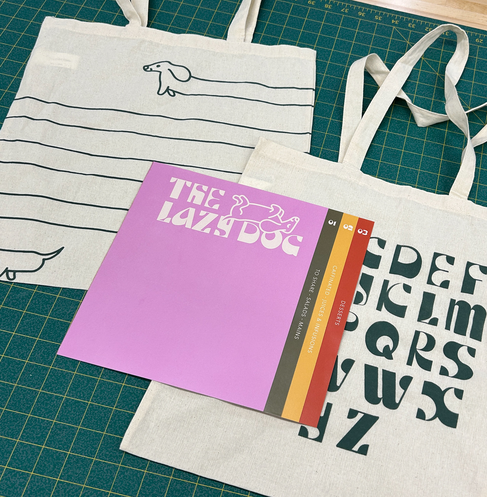
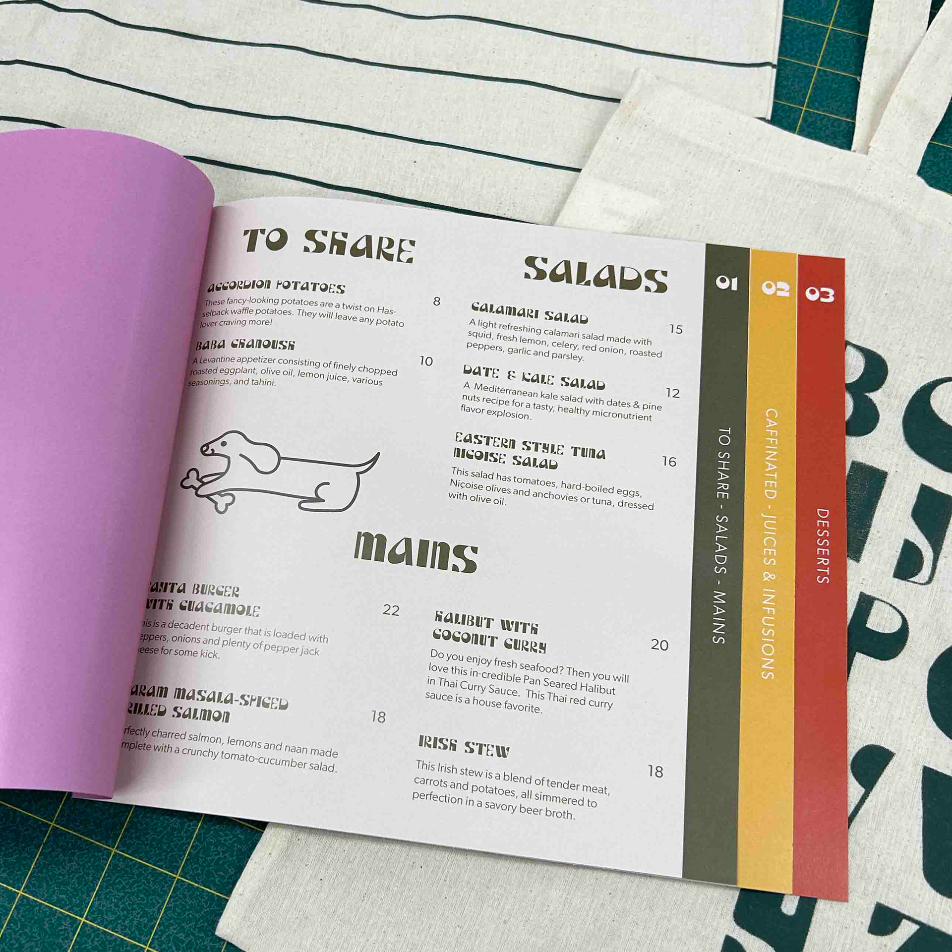
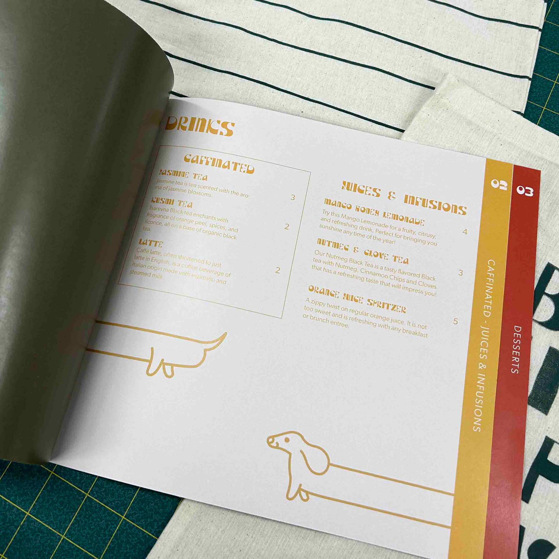
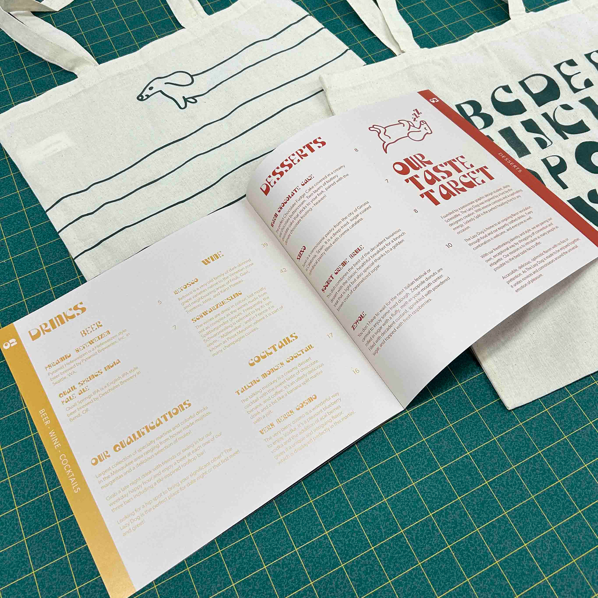
'Lickedy Split' is a heading font created with intense contrasts and captivating energy. As a type specimen, a hypothetical restaurant was created called the Lazy Dog to properly highlight its fun spirit. Meticulous measuring and design were essential to make the perfect cascading tab system along the side of the menu.
This menu includes exactly 26 alphabetized menu items from Accordion Potatoes to Zeppole.
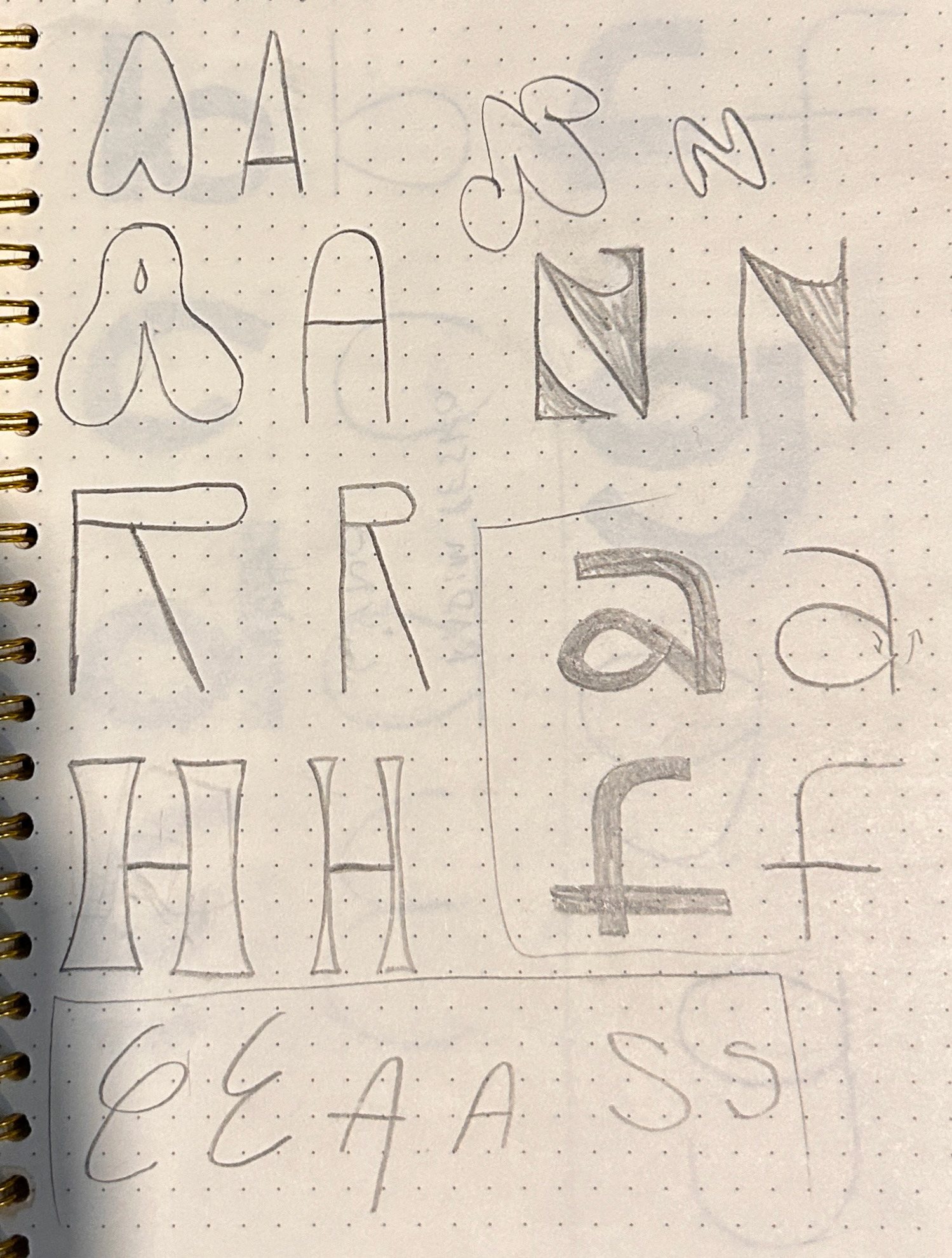
To create an engaging and unique heading typeface, I went through a lot of ideation and planning. An example of one of the MANY sketchbook pages I went through is on the right. I wanted to explore every variation I could think so.
Shown below is my work on a rough draft of what the menu pages would be. Initially, I tried to break up the page with shortcuts like dividing lines and boxing out sections rather than using a proper grid and letting that be the divider. This choppy system led to strange lines and just made the page too overwhelming. I stepped away from this in the final product.
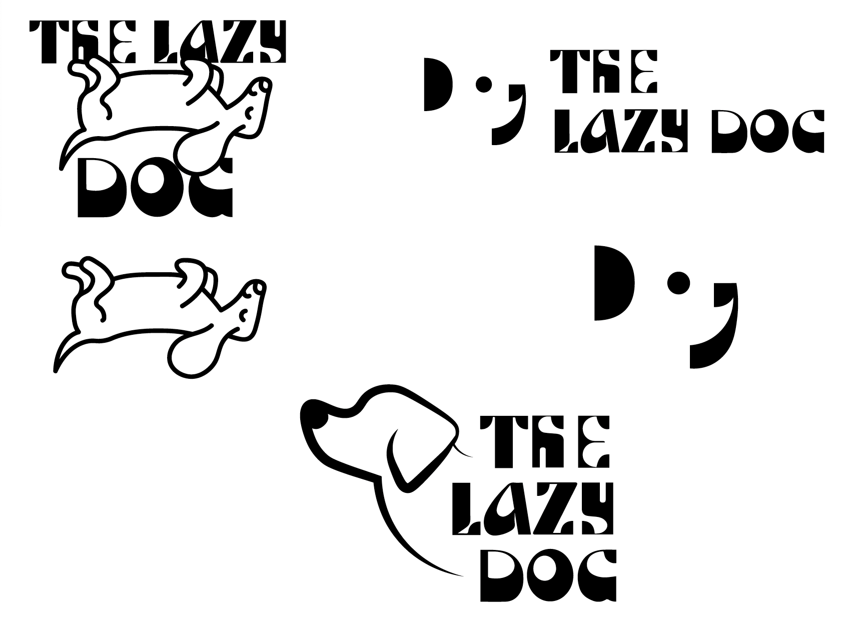
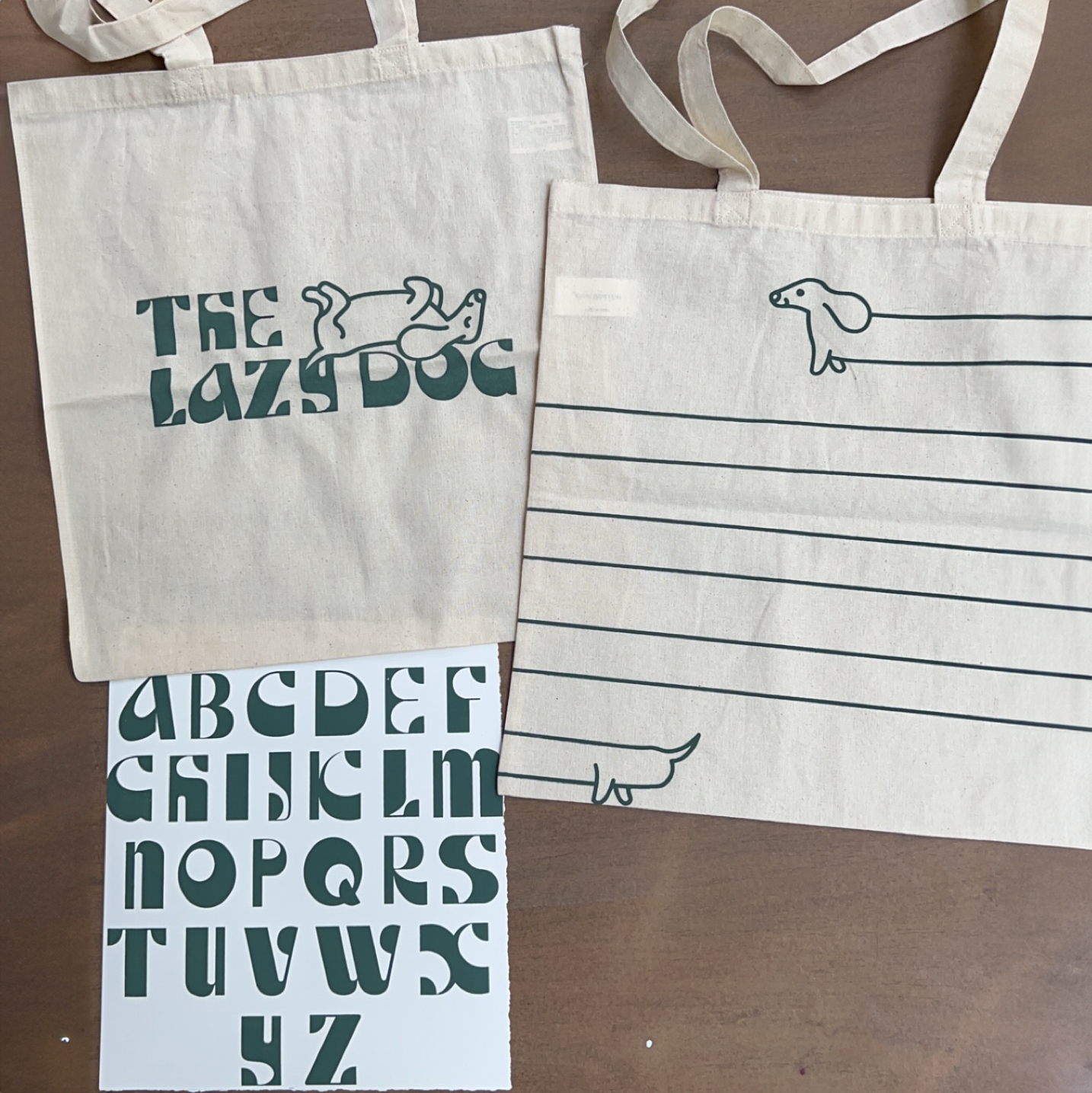
There are also examples of my ideations on finding a logo for the 'Lazy Dog'. Since the display face that I created was so intense and eye-catching, It was a delicate balance to find a logo that would fit the aesthetic and not be too much. I love how the dog became a sort of mascot to be found throughout the menu and the bags.