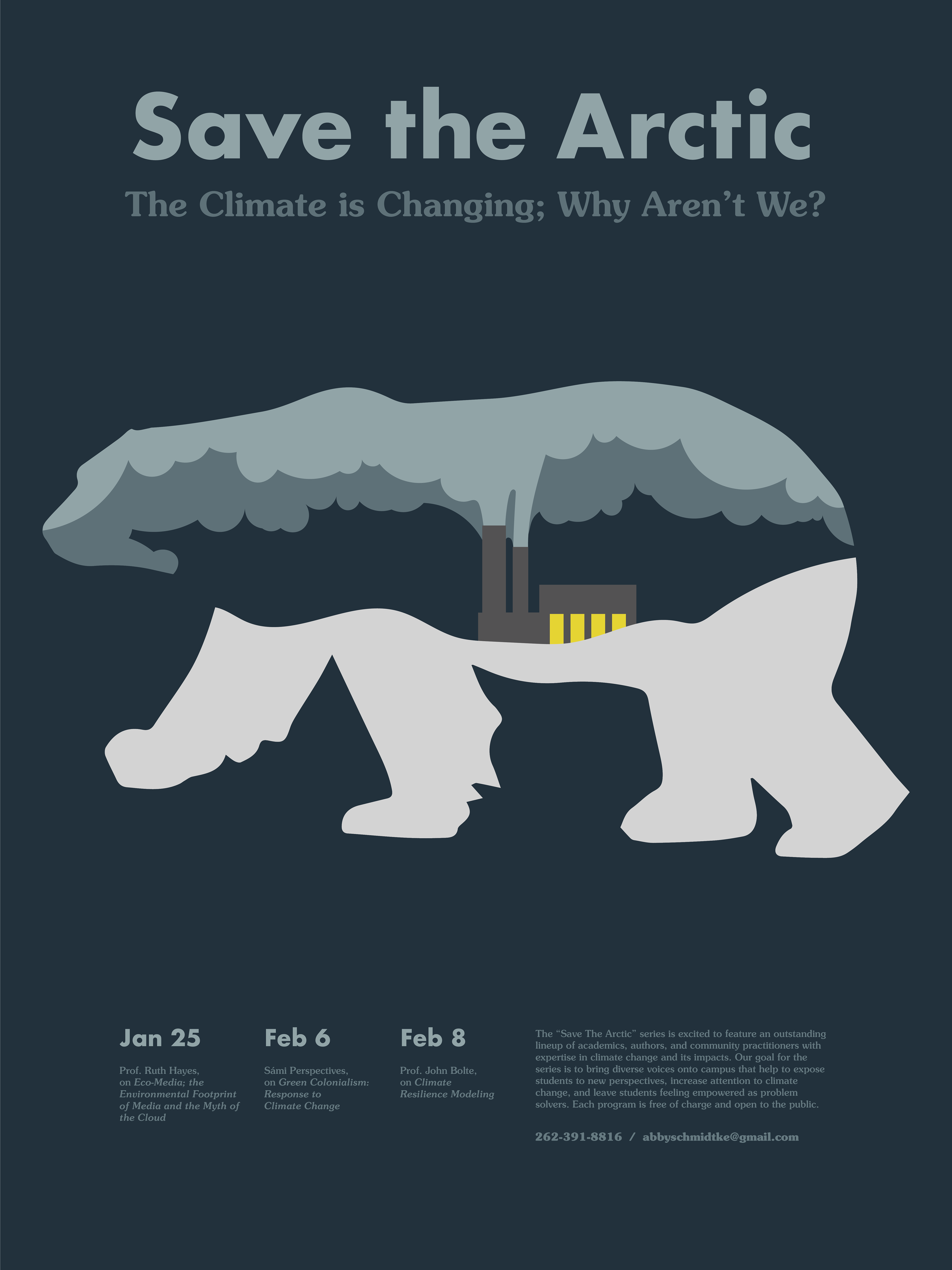
With a clean and subtractive aesthetic, the poster features a dynamic interplay of limited colors and creative cutouts. The use of bold and complimentary typography ensures key information is easily readable, allowing potential attendees to quickly grasp the event details as they are walking past. The goal was to get the intended point across without making the viewer stop to be able to understand the message. The overall layout is intuitively organized, providing a breathable balance between visuals and information.
This design was selected to be in the juried 2021-2022 Bi-Annual UW-Stout Best in Design Show.
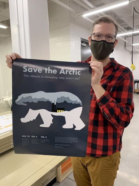
The head of the print lab used to produce this poster noticed my design and specifically asked if he could display in within the digital process lab. It's still up today!
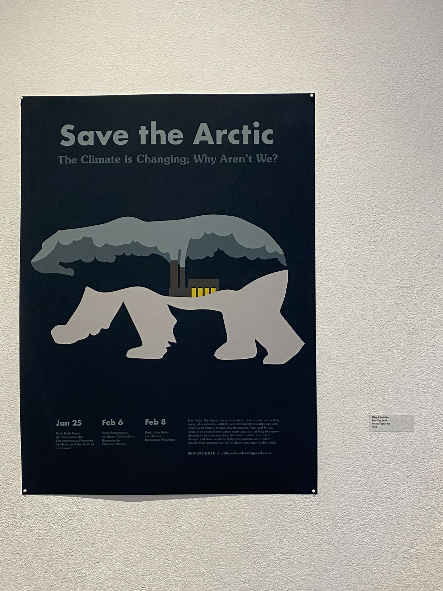
Poster on display in Frykland gallery in the 2021-2022 Bi-Annual UW-Stout Best in Design Show.
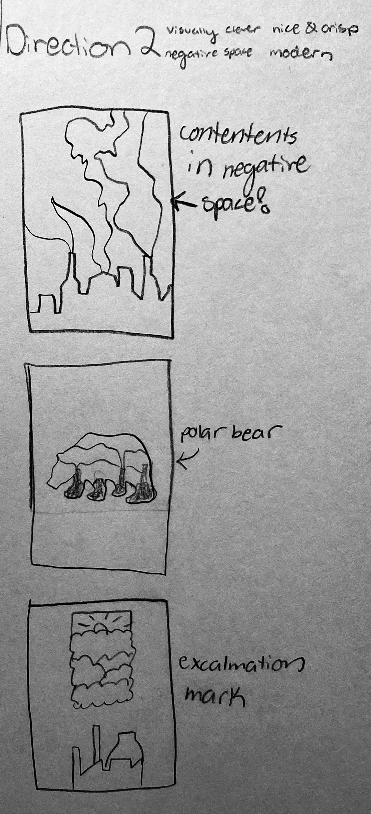
To create an engaging and easily understandable poster, I went through a lot of creativity and planning. An example of one of the MANY sketchbook pages I went through is on the right. I had a lot of ideas but none quite were clicking.
Shown below is my work in narrowing down my initial design sketches. I wanted to create a poster that was about the environment but came across more subtly and didn't 'yell' at the viewer. This is just a sneak peek at the digital ideations that I went through before tweaking and pruning to get to the final product.