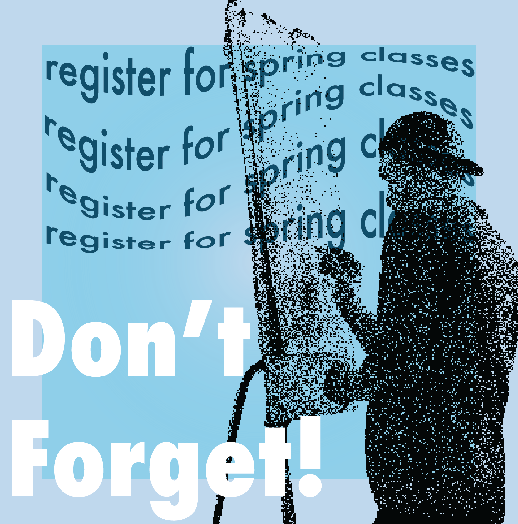
Dedicated to fostering a culture of hands-on education, this campaign emphasized the importance of registering for spring classes with imagery of actual UW-Stout students. From eye-catching social media campaigns to student-centered outreach, I utilized a multi-faceted approach to connect with students and make registration stick in their minds.
This is an example of one of the many campaigns I produced as a Graphic Design intern for Marketing Communications at UW-Stout.


Navigating the brainstorming process entails understanding the diverse desires of our different audiences. Striking a delicate balance, we must ensure the cabinet's approval of the design aligns seamlessly with the likes of the student population. The challenge was amplified as this marked the first campaign that would be incorporating elements of UW-Stout's rebrand. Despite the heightened pressure, I successfully orchestrated a campaign that not only resonated with everyone but also struck a harmonious chord between the familiarity of the old brand and enticing glimpses of the new.
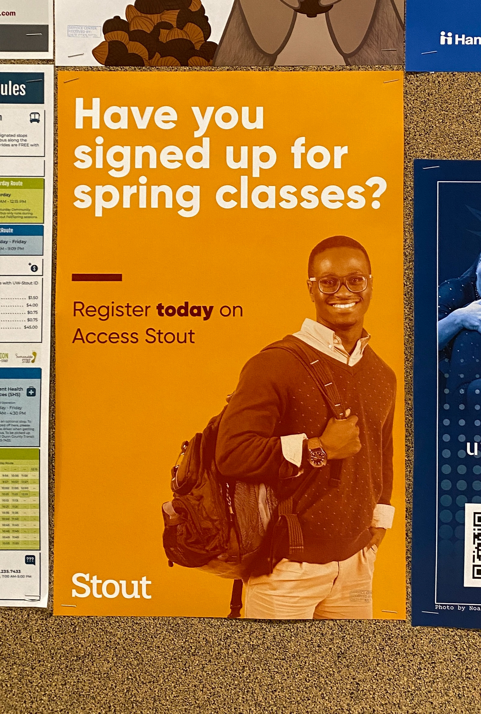
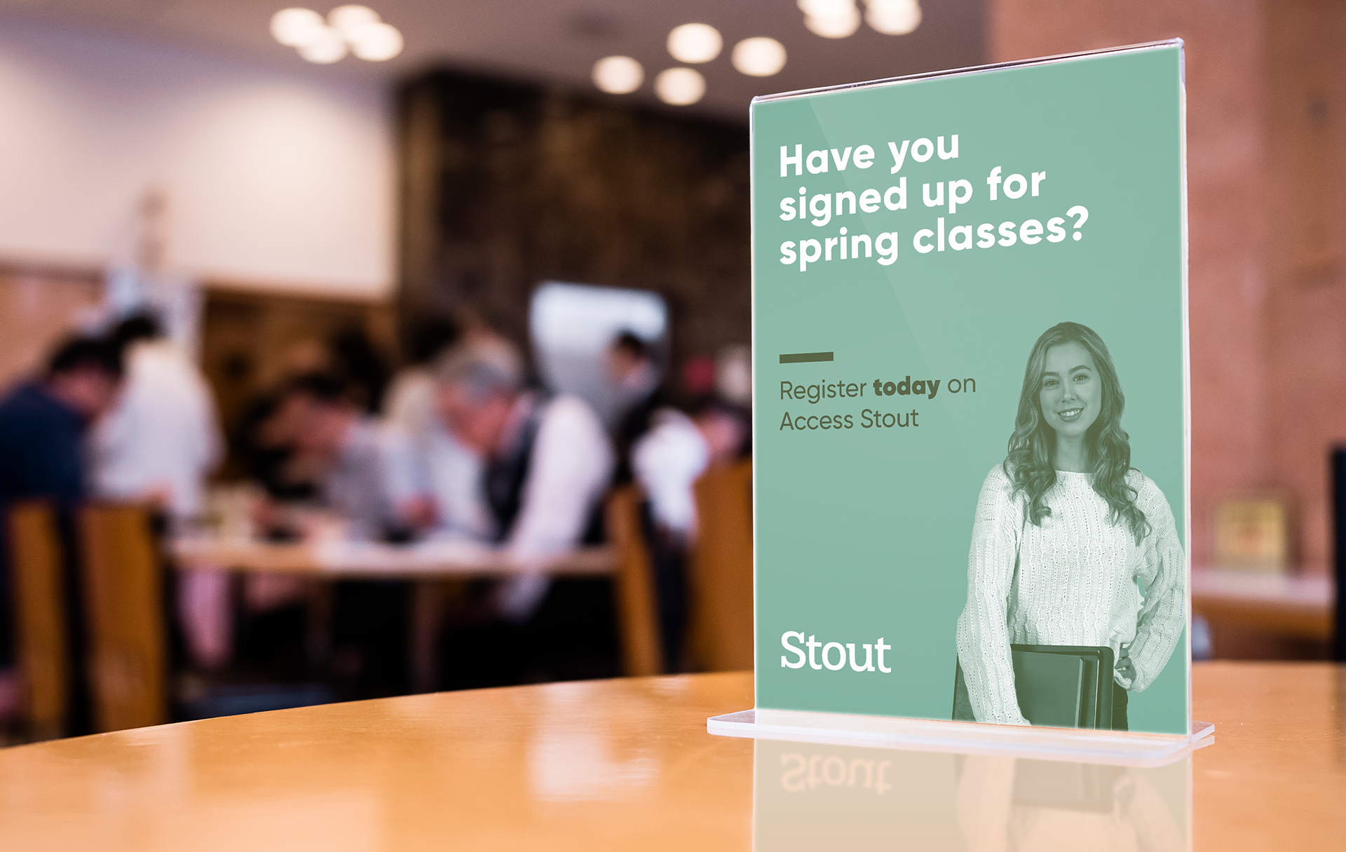


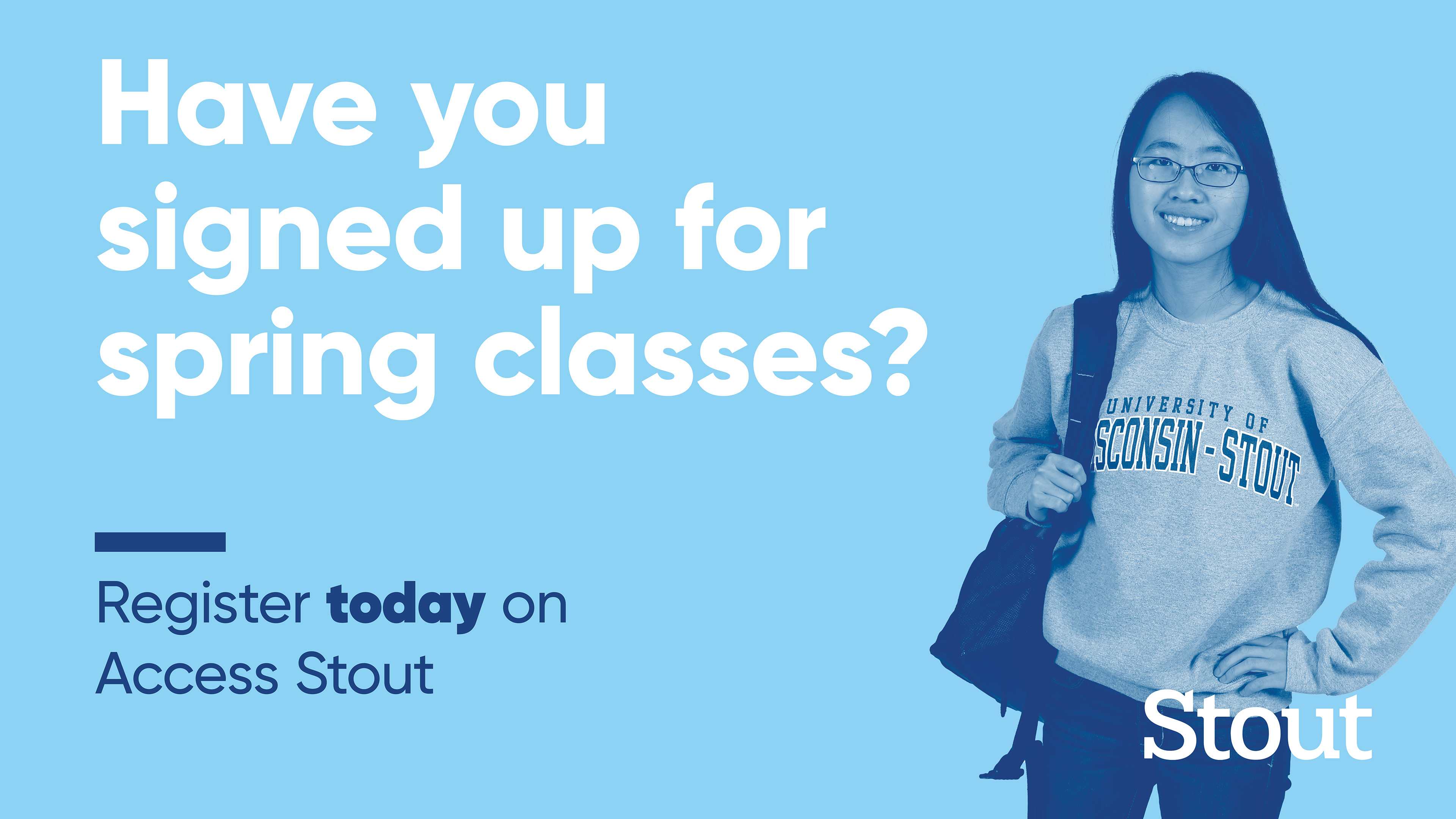
During the planning process, I looked at many other successful campaigns from other colleges and similar colorful and 'pop'-y designs. I presented two different mood boards and explained the appeals from a student's perspective for each. Based on their feedback, I created some rough mockups to help narrow down the intended look. This was before the call to action was nailed down. From there, the cabinet preferred the more colorful and graphic approach so I created the campaign look from there. It is now a recurring look that has been utilized for years since my initial design.