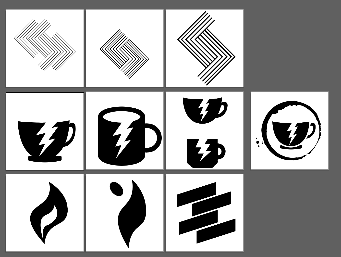
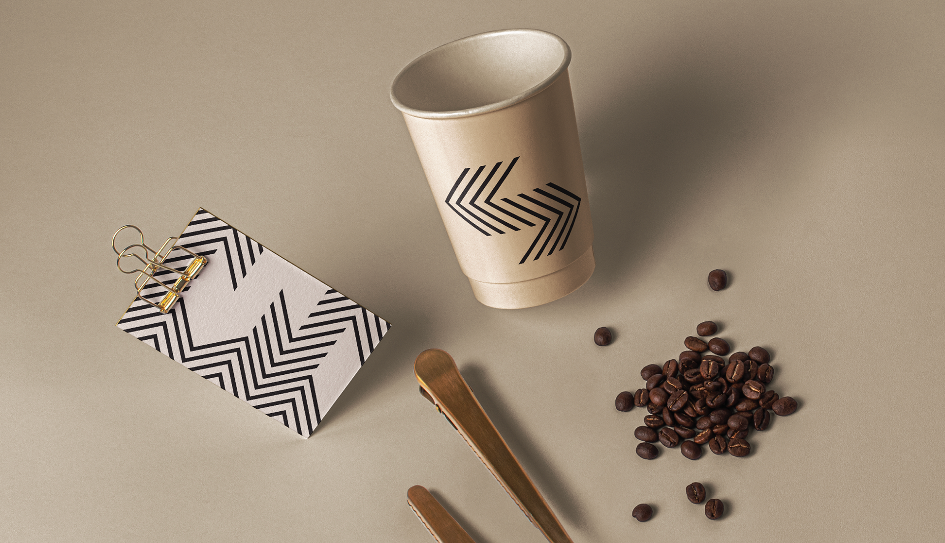
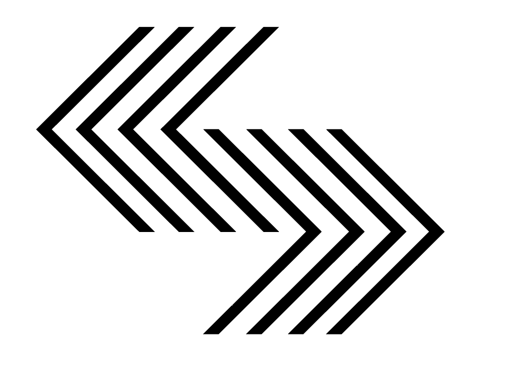
To represent the essence of life, our innovative approach to shaping the 'energy' brand is a fusion of bold lines and powerful symbolism. Per the Gestalt principle of similarity, the lines within the logo will look as if they are vibrating and alive when the viewer looks at the icon from a slight distance. This along with the subtractive design makes a strong representation of a word that could be understood in so many ways.

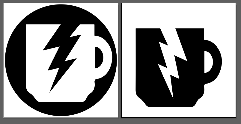
As someone who is probably addicted to caffeine, my initial thought was to use a coffee cup silhouette to represent "energy". The more I ideated the more I realized that this was an easy answer for this design problem and I could push this much further.
As a representational icon, I thought of voltage arrows as inspiration for this logo.